|
|
Typography and Readability on the Screen
Creating text for the screen, in case you plan to offer the product as a digital version, is a special challenge to face.
The reason for this is the medium 'screen' that is tiring when reading for a longs period of time. This is due to an 18 times
lower ![]() resolution than you would have on a paper base. Furthermore, reading is more difficult because of overlaying eye movements and the refresh
rate of the monitor.
resolution than you would have on a paper base. Furthermore, reading is more difficult because of overlaying eye movements and the refresh
rate of the monitor.
This means, if you start reading continuous text phrases, the eye scans the line in loops of the possible focusable area, called saccades. When the eye reaches the next line, it might loose the focus at the beginning of the next line if the saccades overlay with the refresh rate. Especially difficult are long lines, because of the long distance they eye has to move from the end of the line to the beginning of the next.
These reasons lead to compromises. Technically, an electron beam is sent through a dot mask onto a gleaming layer on a monitor
- see ![]() Displaying on a Colour Monitor. The letters can only be displayed via this mask, that creates the steps you can see as follows:
Displaying on a Colour Monitor. The letters can only be displayed via this mask, that creates the steps you can see as follows:
The explanation for the so called 'stair-case effect' is the fact that your monitor most likely has a raster display, which
means that the electronic beam always follows the same pattern with a special ![]() refresh rate.
refresh rate.
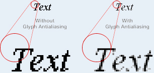
You might produce relief with a technique called ![]() Antialiasing
Antialiasing
 Antialiasing
 Depending on the aim of your product, you generally have to decide on either creating text passages as ![]() bitmap fonts or
bitmap fonts or ![]() scalable screen fonts.
scalable screen fonts.
Fonts for traditional paper layout are unfortunately mostly not transferable to computer layout. Exceptions exist, but need to be evaluated for individual point sizes of the text’s height. For computer use, special fonts have been created, e.g.
- Chicago
- Verdana
- Geneva
- Trebuchet MS or
- OCR A/ B
Its design has been adjusted to 72 ![]() DPI of a screen and for reading optimised.
DPI of a screen and for reading optimised.
With the knowledge about the different kind of fonts, you are now prepared to start with typographic presentation for maps on the web. In case you want to offer your map product via www, some special rules need to be followed. As it is a broad field where much information can be found on the web, we will propose some adequate links to this theme and recommend book titles, which you are invited to look at optionally. There you will find answers to:
- A book reference with promising and valuable information concerning optimal application of typography on the web and what
you have to consider when publishing fonts on the web. Further Information concerning the layout on the www:
http://www.typo-und-layout-im-web.de/ - 4 different ways to publish type on the web:
http://userpage.chemie.fu-berlin.de/~frech/fczb/font/ - A book especially on typography and layout for digital media
http://www.typo-digital.de/typo.htm - Here you will find anything about design, typography, etc.
http://www.drweb.de/weblog-verzeichnis/webdesign-1.shtml - If you need special help for HTML and CSS generation, you will find a complete tutorial here:
http://de.selfhtml.org/
Have a look at the following information regarding writing for screen applications and consider it as a kind of reference book. The cartographic rules for positioning are still valid and have to be applied.
