|
|
Theory of Lettering Maps
Official map sheets may contain between a hundred and a thousand names in all. See the *.pdf for a differentiated source concerning the density of type and its type size.
The lettering is important in the means of linguistic, practical, technical and aesthetic aspects. Illegible or non-existing type on a map could cause enormous damage to man and nature. Think about a non-specified refuge in the Alps on a winter-season map and a snowshoeing group that suddenly needs shelter because of bad weather conditions. They might not consider the non-named house on the map to be a known shelter.
You will have to consider liability for linguistic-geographic problems as well as name quantity and its design. For the font design in maps, you need to decide on the font-family, its basic forms like size and the positioning of the type, dependant on the space that is left next to the other map elements. Then you need to differ between lettering topographic or thematic maps. In topographic maps, it is a main explanatory component, in thematic maps it is additionally important for orientation. Necessary requirements include:
- All names with their correct syntax
- The approximate position of the names
- The type classification according to its kind and size with correct colour identification
Those 3 points need to be defined in your editorial before you can actually start with type positioning.
Map-type will be placed on the map after the situation has been placed and will certainly overlay parts of it. The attempt lies on remaining the readability of the situation on the map. This means you will need to generalise the amount of type you want to show.
The labelling of the scalebar displays a specialty:
Place the digits in a group of three. For every blank space dispatch a quarter- to an eighth ![]() quad. One turquoise box = 1 Quad. Today’ s layout and text programs offer this possibility.
quad. One turquoise box = 1 Quad. Today’ s layout and text programs offer this possibility.
 Lettering a Scalebar
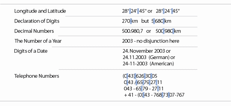
Guide yourself through the following list of spelling digits. You might need one or the other for marginal notes, e.g. explanatory notes, diagrams and source material declaration. The little blue boxes stand for white spaces!
 Lettering Numbers
The following link contains 5 considerations E. Imhof made on type presentation to guarantee an aesthetic, pleasing, quite and fluid effect while reading map names. For you it is optional, additional content.
General Viewpoints and Postulates.pdf
Based on experiences made by manual map lettering, the Institute of Cartography of the Federal Institute of Technology in Zurich created a composition about relevant factors. You may obtain this document as a further reading source. It is optional for you and written in German.
Basics for Lettering Maps with Sans-Serif Linear-Antiqua Type.pdf
As promised, we now come to the specific lettering rules. Here are 4 general aspects:
After we explicated the basic rules, we would like to give you the facts about local-, linear and areal designation.
A speciality in this field is the placement of names on streetmaps. Have a look through the attached pdf document for deeper insight.
