|
|
whiteboard discussion
Gather in groups of 2 or 3 students for an online whiteboard discussion. For the discussion please keep the following aspects in mind:
- After welcoming each other, make an agreement on who is loading the attached file into your workspace.
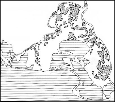
- Take a minute to get a first impression of the image’s content.
- Then start to clarify each others impressions. Allow at least 15 minutes for this textual and graphical communication part. Keep objective! Find an answer to the following questions:
- What is displayed? – textual communication
- How is its graphical expressed? – Create a legend on the existing elements
- What are the problems exist with this map? – Would you, the user, be happy with it? – Record headwords, textually.
- Test some new presentation possibilities. – Be creative but keep the subject matter in mind. Finish this when you have agreed on a new legend.
- Make some closing comments on your results.
Leave your communication group and come back to this learning objective.
 Map for Discussion
It is often difficult to adhere readability rules on a map, but without paying attention to them, lower quality maps are the result. Cartography is not an intuitive type of art in which the graphic elements may be rearranged at will. Many of the shapes and their locations are imposed by geographical or locational facts. Nevertheless, these guidelines should be applied whenever possible.
