|
|
Graphic Density
Graphic Density is another aspect of graphic semiology mentioned in (Bertin 1967). The bottom line of his achievements states: The readability of maps is conversely proportional to the amount of represented
cartographic information. That means, the more elements you have, the less readable they are. Two or three additional and
thus readable maps should always replace one overloaded and difficult to understand map. An optimal quantity of cartographic
elements per cm2 is needed in order to achieve a readable and comprehensible map.
If the graphic density of cartographic elements is too high, the readability will be badly affected. This means: The outcome
of high density is just a sum of graphics where all detailed bits-and-pieces of map elements are mixed together. This mixture
is mostly insignificant for the map user. In contrast to this, presenting too little density, the graphic expression will
be underdeveloped.
Ideal is a graphic density of 10 elements or signs per cm2. It is necessary that the element density be considered on your map. You can either decrease the number of graphic variables or modify the map scale if the density is too high.
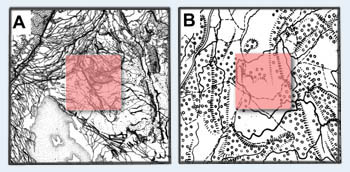
 The Maximal Graphic Density of 1 cm2 (Bertin 1967)
Two map examples of India, taken from the "Graphic Semiology" of J. Bertin depict this difficulty. In map A you can see a too high density, e.g. The orange square in this case represents an area of 1 cm2. The graphic information is not significant here. In map B a correct density of elements is shown. The information here is legible and thus significant.
