GITTA-Logo
PDF Version of this document Search Help Glossary

Lesson Navigation IconLayout Design Settings / Graphical Semiology

Unit Navigation IconMap Size and Scale

Unit Navigation IconDefinition and Organisation of Map Elements

Unit Navigation IconTypography

Unit Navigation IconColour Design

Unit Navigation IconReadability Rules

LO Navigation IconBalance of Map Elements

LO Navigation IconContrast Design of Visual Tone

LO Navigation IconGraphic Density

LO Navigation IconShape Readability

LO Navigation IconAngular Readability

LO Navigation IconReadability of Colour Patterns

LO Navigation IconLand-Water Contrast

LO Navigation Iconwhiteboard discussion

LO Navigation IconTest your knowledge about readability here

Unit Navigation IconMap Critics

Unit Navigation IconSummary

Unit Navigation IconRecommended Reading

Unit Navigation IconGlossary

Unit Navigation IconBibliography

Unit Navigation IconMetadata


GITTA/CartouCHe news:


Go to previous page Go to next page

Angular Readability

The visual presentation of any object is bordered by angles. The presentation of the angles can be less readable, depending on:

  • shorter angle lengths
  • angles that approach the 0° or 180° - axis.

In general, there is a need to differentiate between two types of angles:

  1. Clearly legible angles:
    Clearly legible angles are perceived by taking a deep look at each element on the elementary level on a map.
  2. The "vague" angle:
    This angle can just be seen, within the entire image. For example: In a 2-D diagram this one points out the relationship between the 2 aspects of the x and y axis.

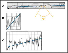
For further explanation have a closer look at the following graphic, a diagram that could be part of a legend on a thematic map:


Legible and Vague AnglesLegible and Vague Angles


In graph A, , the net and legible angles are perceived at once because they are close to 70°, an optimal stage for angle readability. The secondary vague angle (blue line) is too weak and almost invisible. In contrast to A the vague angle perfectly visible in B (blue line), but here the disadvantages of the clearly legible angles appear. They are close to 0°. Finally, the angular legibility is ideal in graph C: It corresponds to a compromise between the elementary and secondary level of reading. Neither acute angles or obtuse angles are used and neither a long or too higher stretched diagram-form chosen.

Test your knowledge of angle readability with the following animation.

The Angle_readability
Top Go to previous page Go to next page