GITTA-Logo
PDF Version of this document Search Help Glossary

Lesson Navigation IconLayout Design Settings / Graphical Semiology

Unit Navigation IconMap Size and Scale

Unit Navigation IconDefinition and Organisation of Map Elements

LO Navigation IconDefinition of Map Elements

LO Navigation IconOrganisation of Map Elements

LO Navigation IconInternal Organisation of Map Elements

LO Navigation IconHierarchic Organisation 1

LO Navigation IconHierarchic Organisation 2

LO Navigation Icon Hierarchic Organisation 3

LO Navigation IconThe Golden Section

LO Navigation IconFocus of Attention

LO Navigation IconConstruct your Map

LO Navigation IconSummary

Unit Navigation IconTypography

Unit Navigation IconColour Design

Unit Navigation IconReadability Rules

Unit Navigation IconMap Critics

Unit Navigation IconSummary

Unit Navigation IconRecommended Reading

Unit Navigation IconGlossary

Unit Navigation IconBibliography

Unit Navigation IconMetadata


GITTA/CartouCHe news:


Go to previous page Go to next page

Hierarchic Organisation 3

How can hierarchical organisation be used to organise the map elements?

  • Sort through the components of the map to determine the relative importance of each one. Seek then, a visual solution that will cast each component in a manner compatible with its hierarchical position.
  • Map objects that are most important are rendered with the greatest contrast to their surroundings. Less important elements are placed lower in the hierarchy by reducing their edge contrasts.
  • Mapped objects and their relative importance assume a place in the hierarchy. Although identical objects may vary in relevance, depending on the map on which they are placed.

The following illustration will explain to you how to achieve a hierarchical organisation of the map elements for a correct presentation.

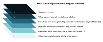
Hierarchical Map OrganisationHierarchical Map Organisation
Top Go to previous page Go to next page