|
|
Map User and Map Communication
Each map user group may vary from another in terms of its familiarity with graphic and symbolic conventions, its geographical knowledge, and its perceptual limitations in general. Therefore, when you design a map, you should only include map information that is meaningful for a specific type of user group.
The perceptual limits of the map user may sometimes be a significant element for map design. For example, older people have more difficulty perceiving small types and must hold visual material closer. An extreme example is provided by the problems of making maps for blind people, which attention must be paid to things such as tactile symbols. More information to design colour maps for partially sighted user, can be found at the unit "Colour Design".
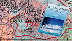
As an example, look at the Ski Touring Map Serie «S». This 1:50 000 map has been produced by Swisstopo in cooperation with the Swiss Ski Federation in order to have better user knowledge. This close collaboration brought specific Ski Tour information:
- Map is light and easy to handle (possibly with gloves).
- Tours and mountain refuges can be seen quickly. Information is clear and legible, even in case of danger (storm, fog, cold, etc.).
- Because most ski hikers have a good map reading knowledge, topographical and geographical information is also present on the map (for slope gradient, orientation, etc.).
- The map has specific extra information: index of tours with a short description and degree of difficulty, information on rescue services and avalanches, lists with important phone numbers (rescue, weather, avalanche hazard bulletin).
 Ski Tour Map Serie«S»: Passo del Bernina, reproduced with the permission of swisstopo (BA057224) ( Swisstopo)