|
|
Visualisation
What is Visualisation?
Generally, scientific visualisation can be seen as a computer-assisted method, which can transform data and results of analyses into visual modes that could otherwise not be seen for instance due to their abstract nature. Thus, visualisation allows us to work very quickly and in an interactive way, with images and their underlying related data.
Visualisation and Cartography
In the context of cartography,
concepts of modern scientific visualisation are only starting to be applied and even
defined. 3D-visualisation with its continuous x, y and z data, however represents an
indisputable advantage for cartography: It reports a three or
multi-dimensional reality, while the traditional paper map or screen is limited to
"2D or pseudo 3D".
But the complexity of such a multi-dimensional image implies that its
application is reserved to a well-prepared public: however attractive the image can
appear, its reading can be challenging.
On the other hand, the image and
its elements should be designed in a user-friendly way in order to allow an easy and
clear interpretation.
Examples of Visualisation of Spatial Data
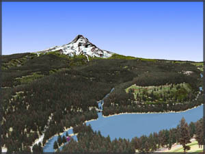
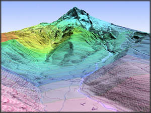
The diploma thesis of M. Dobler at the Institute of Cartography ETH contains good examples of cartographic data visualisation. They have been realized using the software World Construction Set 4 and shows 3D-visualisations of the Mount Hood area in Oregon/USA.
Find a few visualisations, examples below. For more information click here (external link).
Perspective View 1
A perspective view of Laurance Lake and Mount Hood: Vector data of areas and line elements textured with effects: Trees, water, grass, snow.
Raw Data used:
|
Perspective View 2
A perspective view of Old Maid Flat and Lost Creek: Digital Elevation Model, overlayed with a raster file of the annual precipitation combined with a topographic map.
Raw Data used:
|
Panorama Visualisation
A panorama visualisation from Elk Mountain: Digital Elevation Model overlayed with a combination of the orthophoto and the topographic map. The panorama is made up of 16 images in steps of 22.5 degrees. It was created using "World Construction Set", stitched together with the software "VR Worx" and finally saved as a Quicktime movie. Click on the following picture and move the mouse into the direction you want.
|
Quicktime 3D visualisation
|
Raw Data used:
|
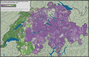
This last example shows a screenshot of a 2D visualisation of statistical data from the Atlas of Switzerland interactive (external link). The software allows interactive queries to be made within the map image.
 2D visualisation, Atlas of Switzerland 1 (Bundesamt für Landestopografie swisstopo (eds.) 2000) 2D visualisation, Atlas of Switzerland 1 (Bundesamt für Landestopografie swisstopo (eds.) 2000) |
Raw Data used:
|


